

Edinburgh Trams
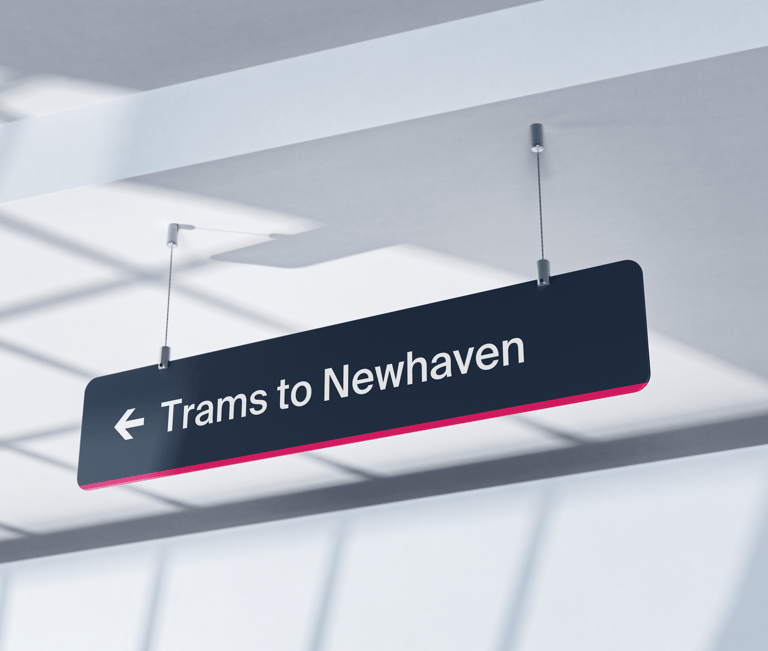
Trams to Newhaven: Information and wayfinding systems
Edinburgh Trams' wayfinding and visual design styles
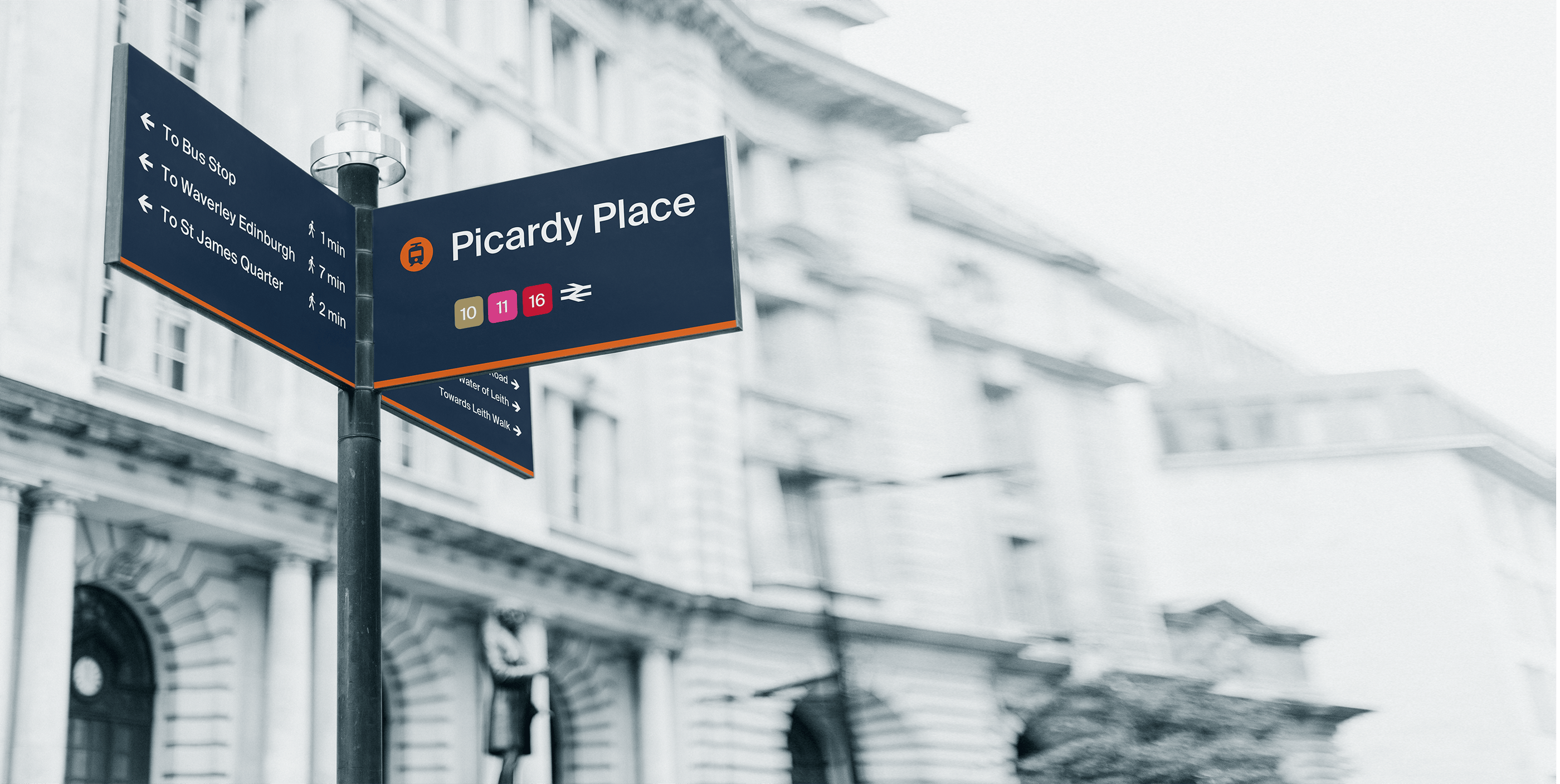
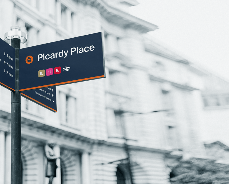
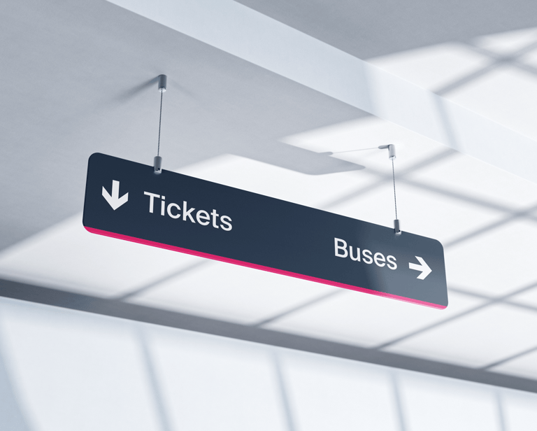
Good signing, directional signing and information system that helps passengers understand Edinburgh trams' and other public transport system. It helps make their journeys without undue difficulty and frustrations.
Project Scope:
Branding
Typography
Information Design
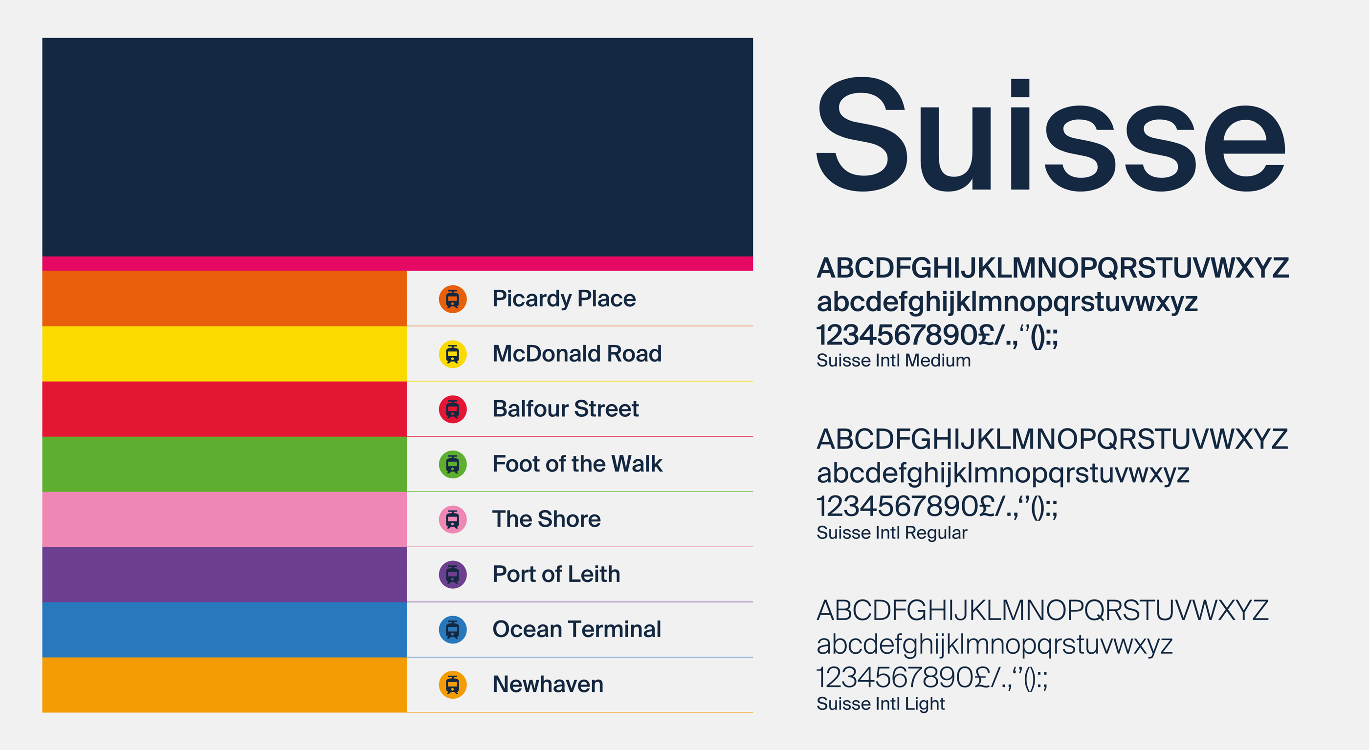
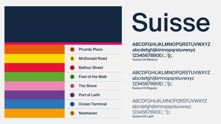
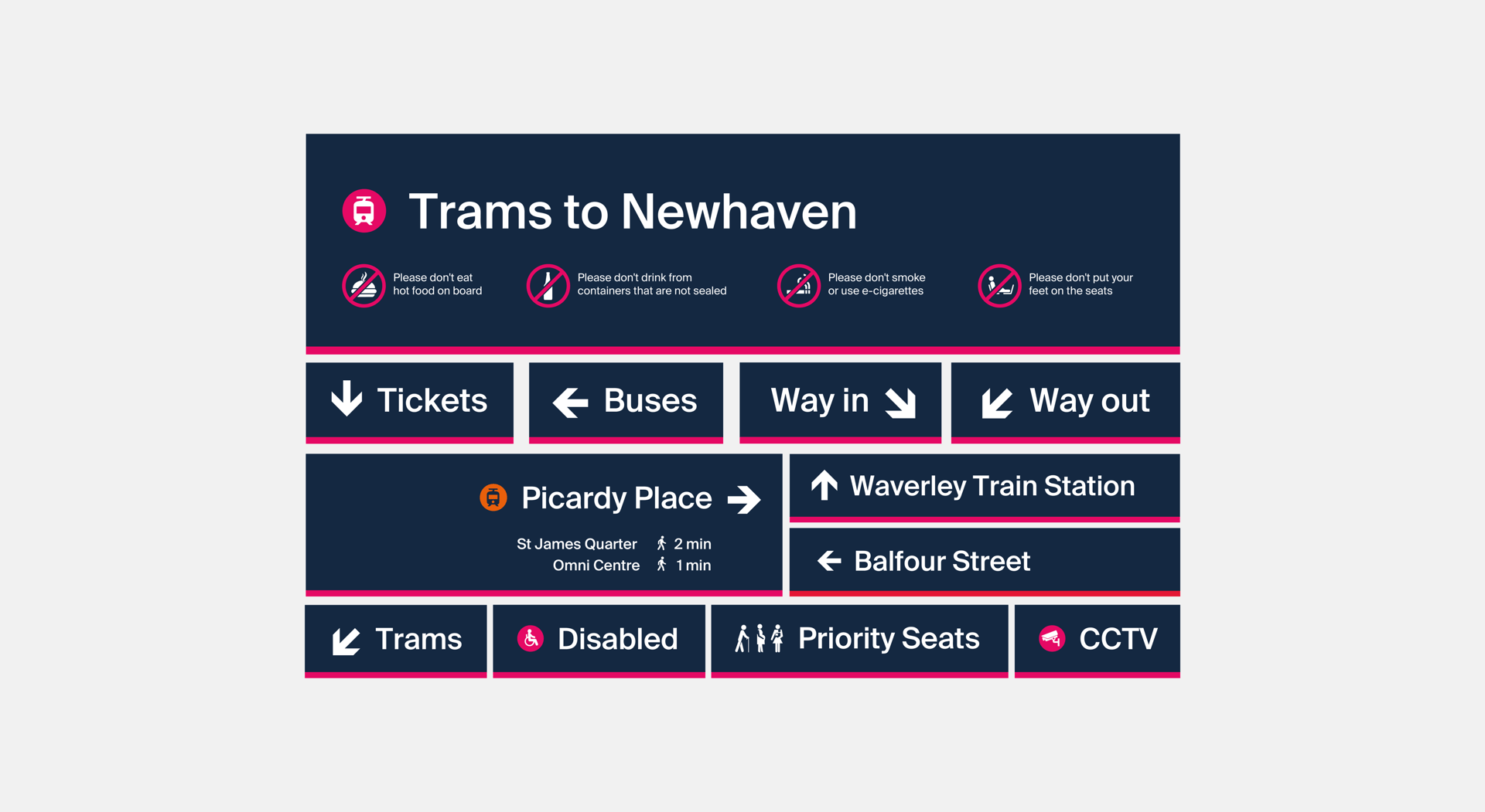
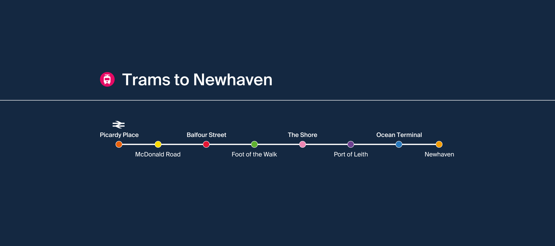
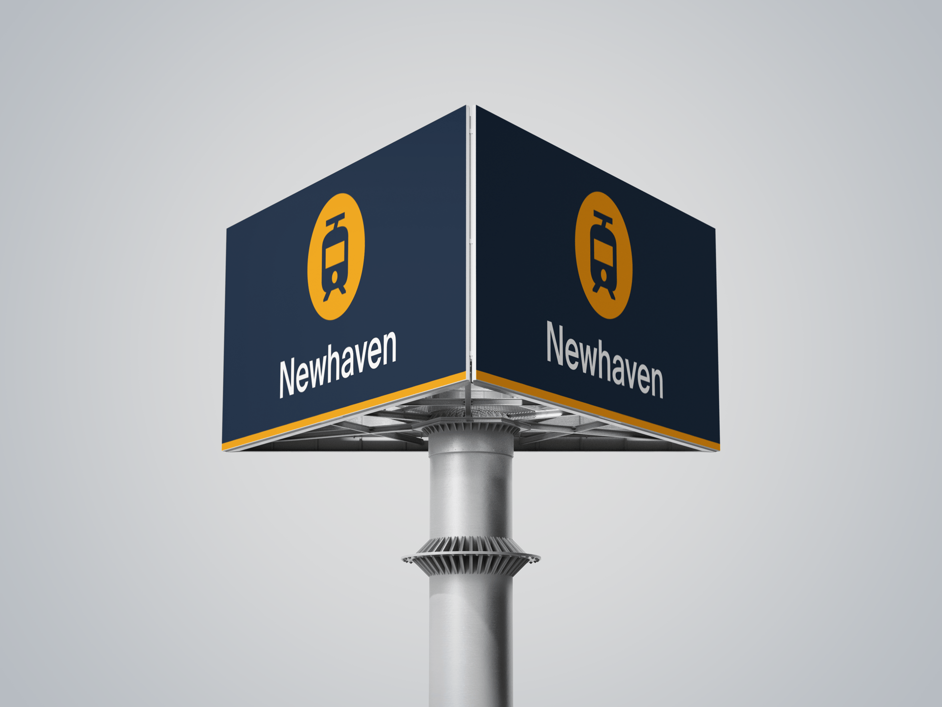
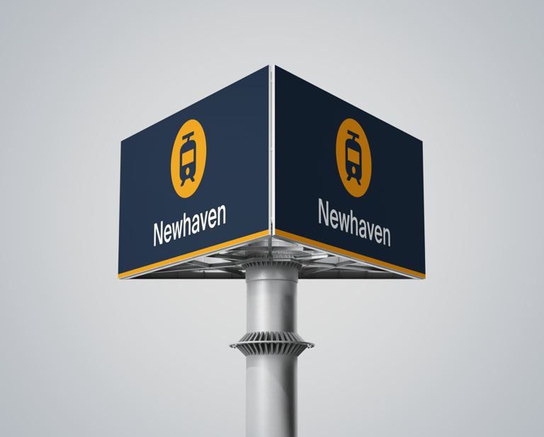
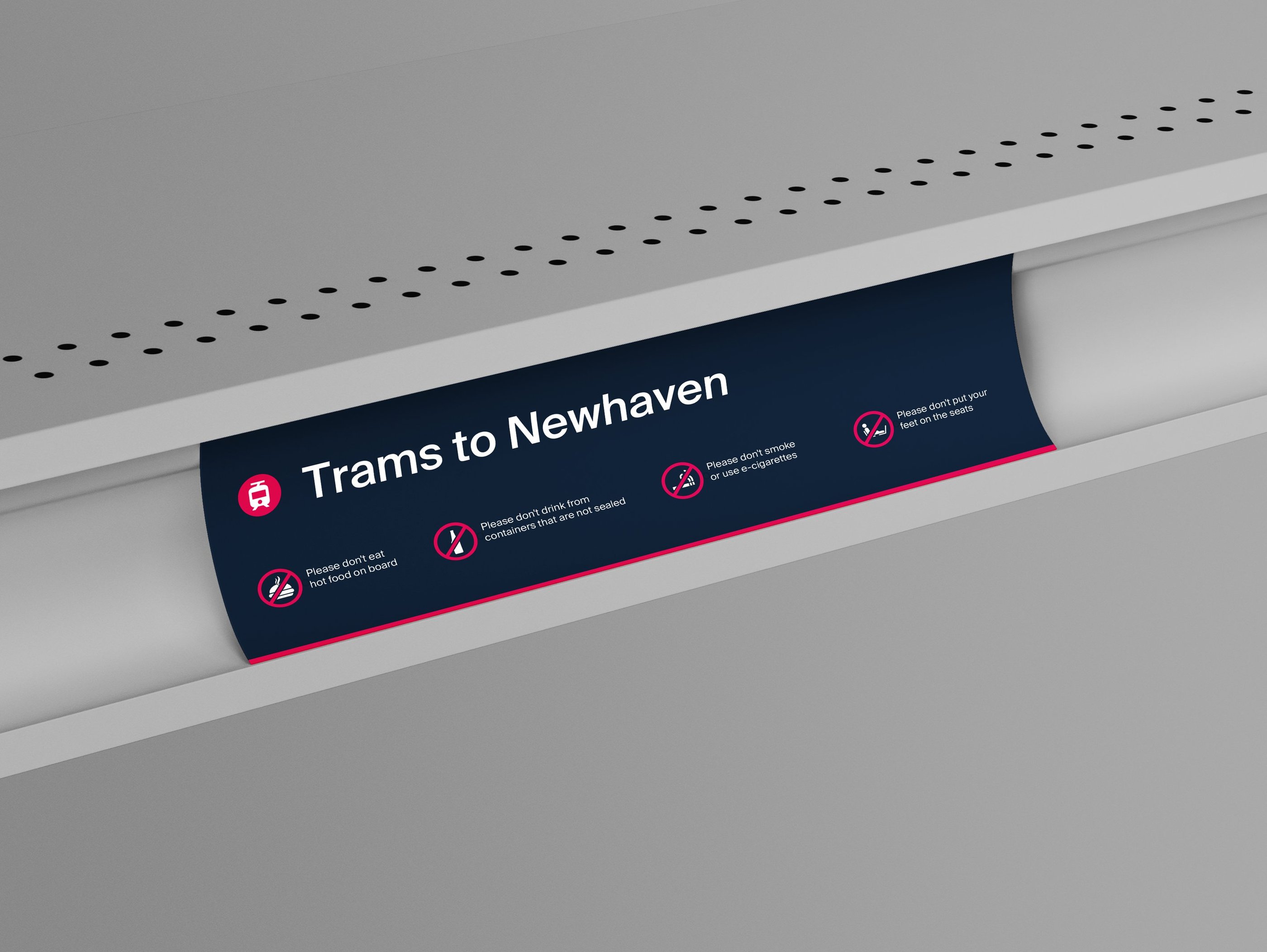
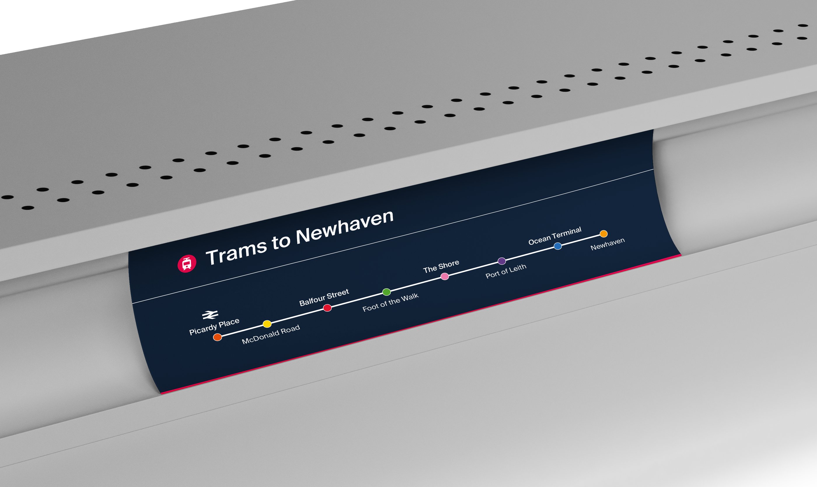
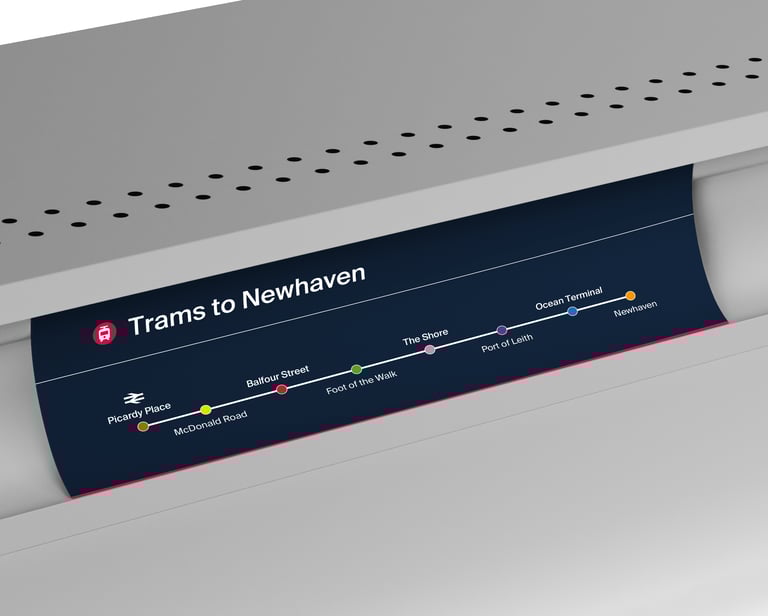
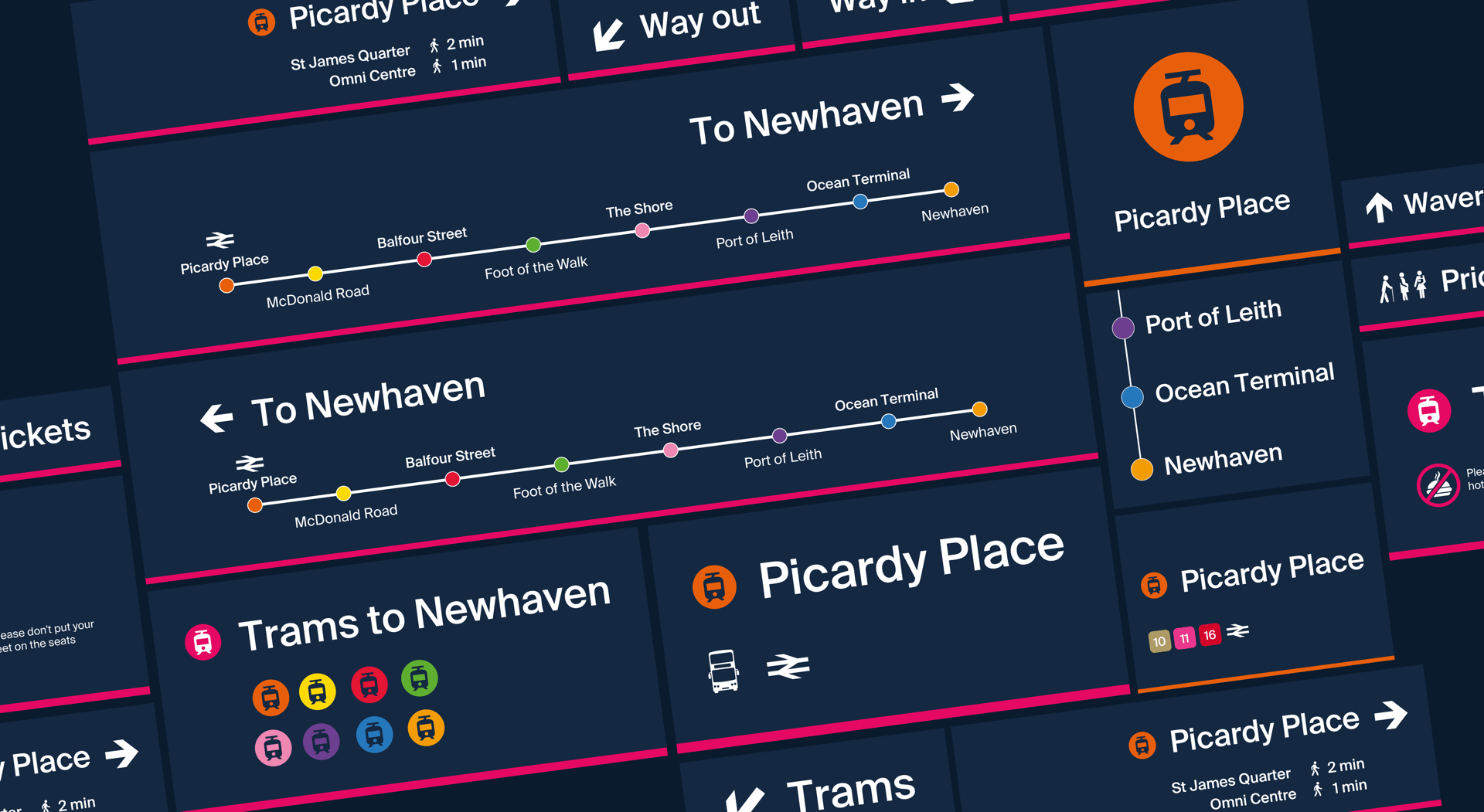
The brand colours for Edinburgh Trams for both digital and print designs are blue and pink, but there are other colours which are to be used when producing tram signages. Each tram stop is colour coded to have a recognisable identity and can be easily remembered.
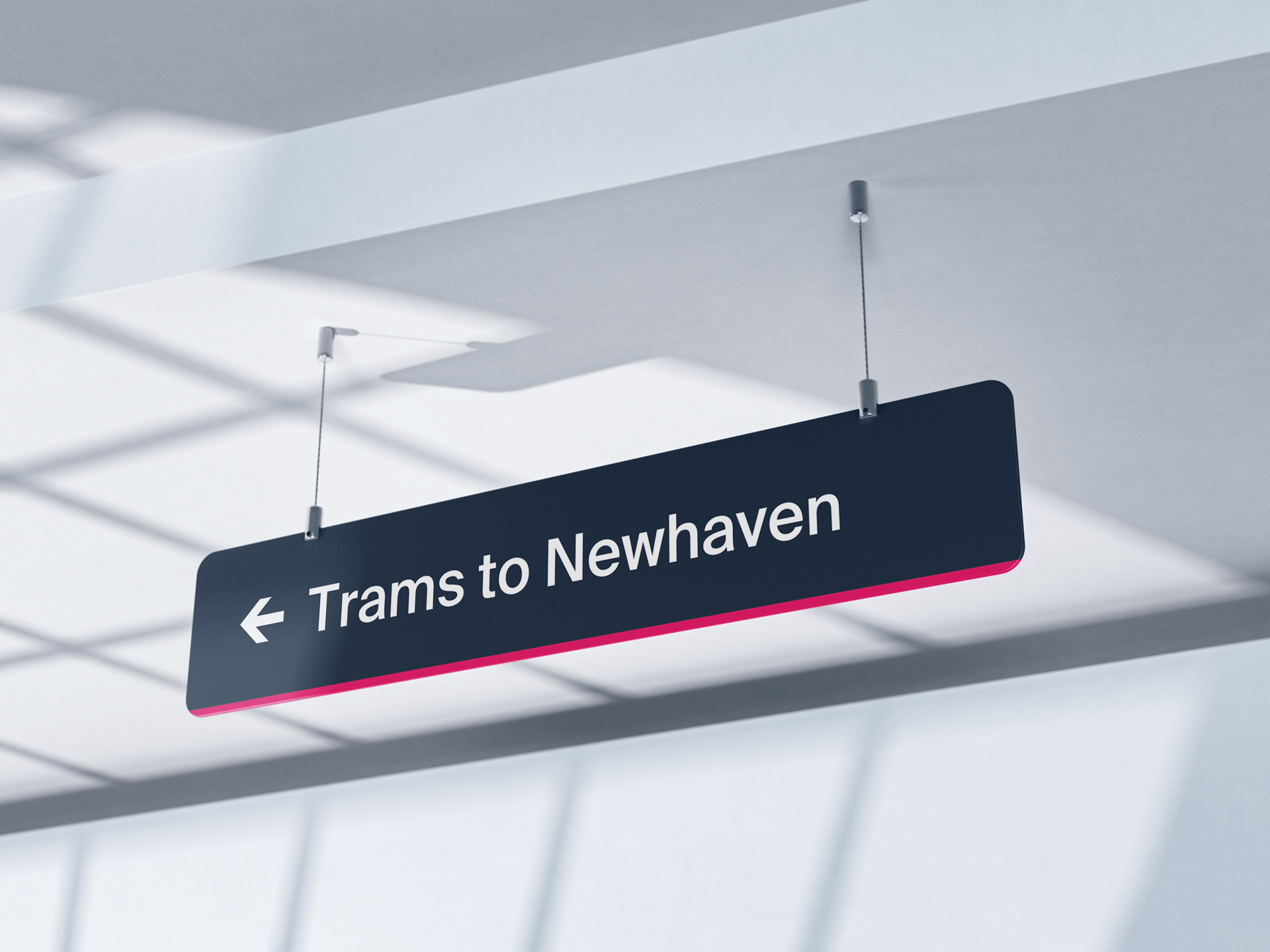
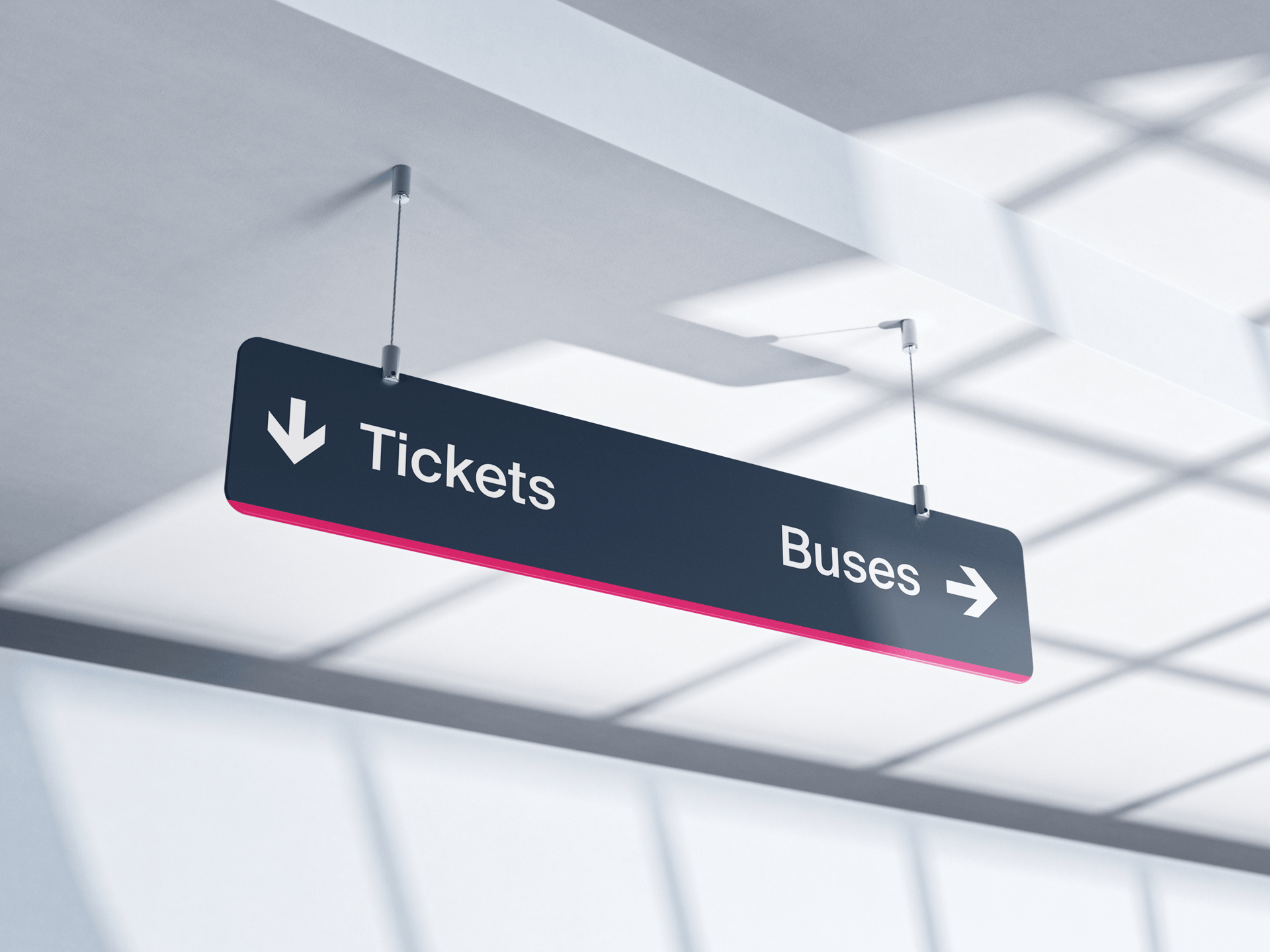
Suisse Intl Medium is Edinburgh Trams’ and Glide App brand typeface and is used for all digital design, signing within the passenger environment, and for a wide range of publicity and other material. It is highly legible and yet ‘friendly’ in tone. The lettering must be shown in upper and lower case not just capitals only. This is to enhance readability when text statements are longer than one word.
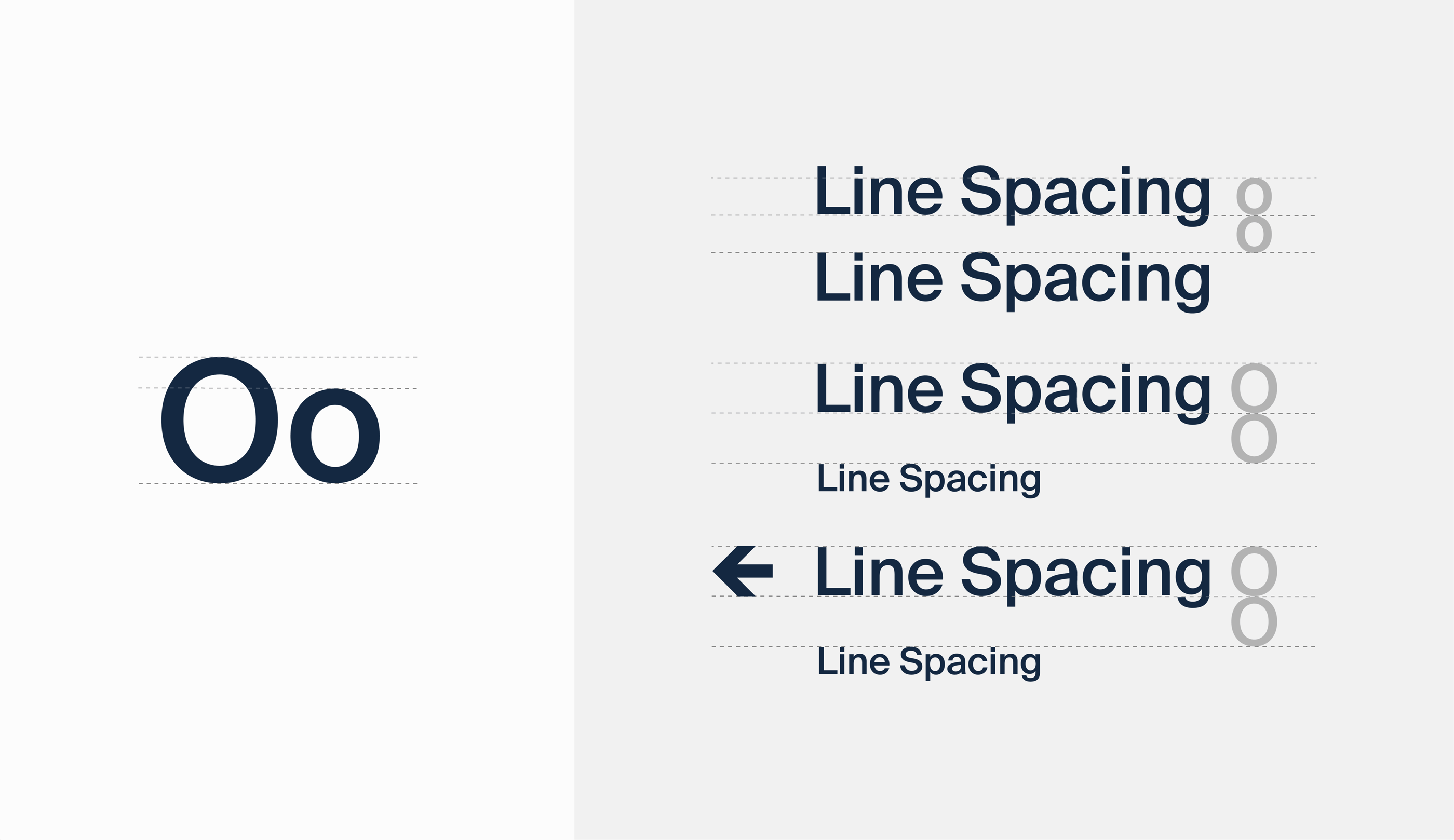
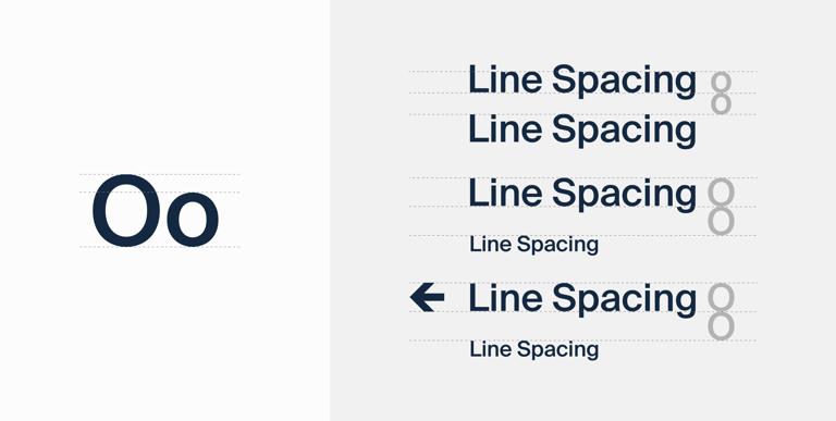
Line spacing is equivalent to the height of the lower case letter ‘o’. When the information is more than one size, the larger ‘O’ height should be used to separate the two lines.
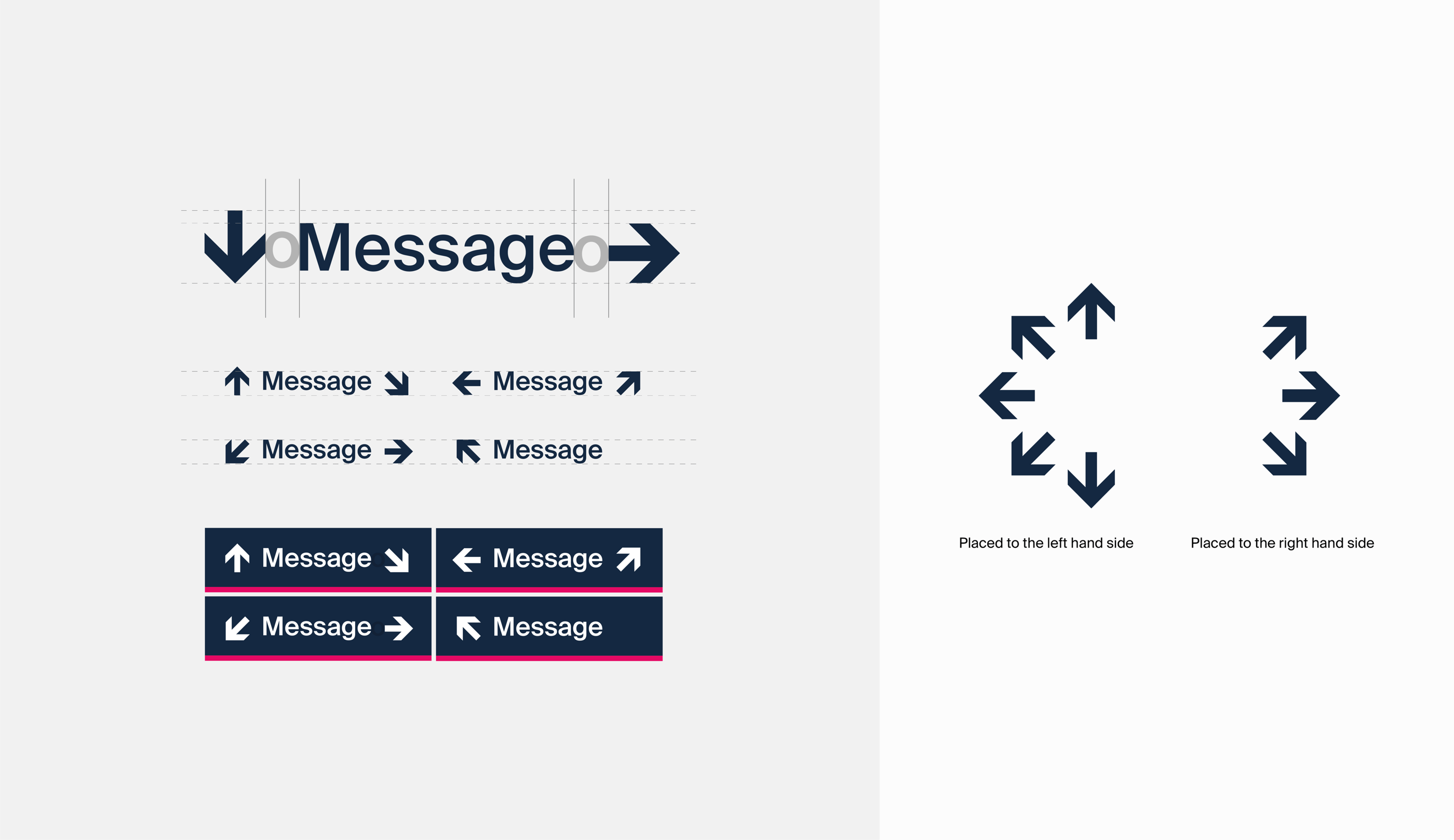
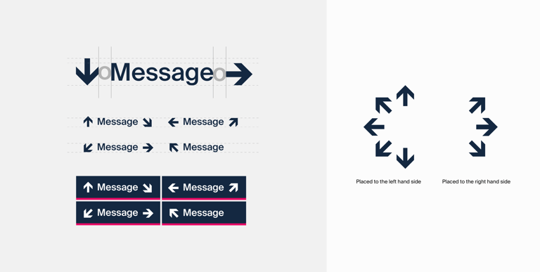
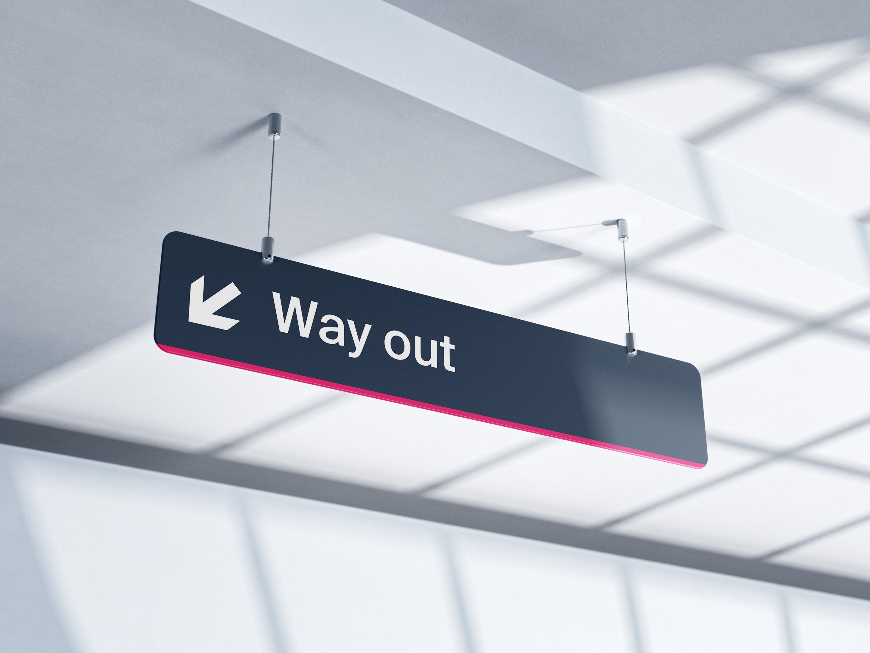
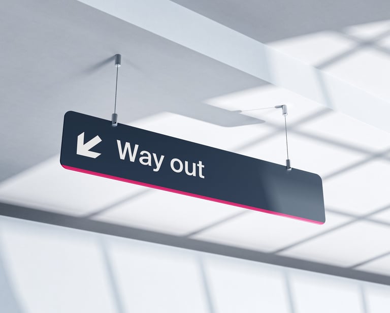
The Edinburgh Trams have 8 directional arrows and must not be altered. Arrows indicating direction to the left, straight ahead or down should be placed on the left hand side of the text. Arrows indicating direction to the right should be placed at the right hand side of the text. Sign messages should be ranged left to right according to the direction indicated by the arrow. The space between the arrow and the text is equivalent to the lower case ‘o’ of the text.
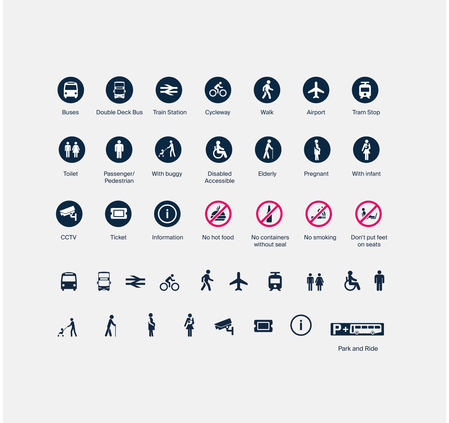
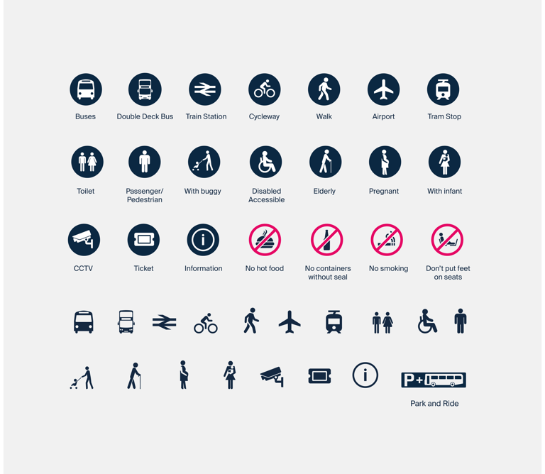
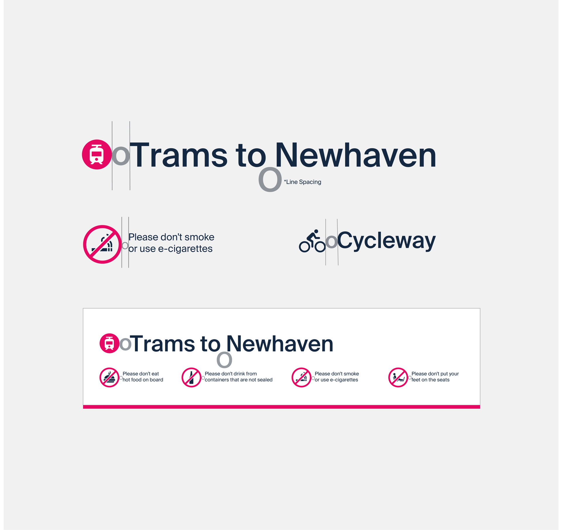
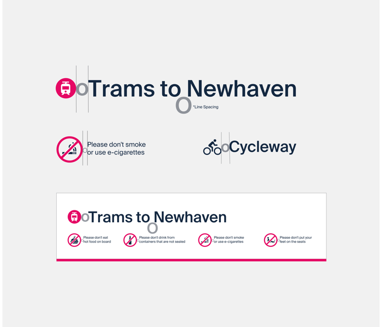
Pictograms are used to help convey the message to those who may have difficulties with the text. These familiar pictograms can be used on both digital and print designs.
When pictograms are positioned alongside text, there is to be a distance of equivalent to a lower case ‘o’ between pictogram and text. In most cases, the height of the pictogram should be at least 25 per cent greater than the text.
More Projects
SynchroStor
Engineering meets design: SynchroStor's brand new look
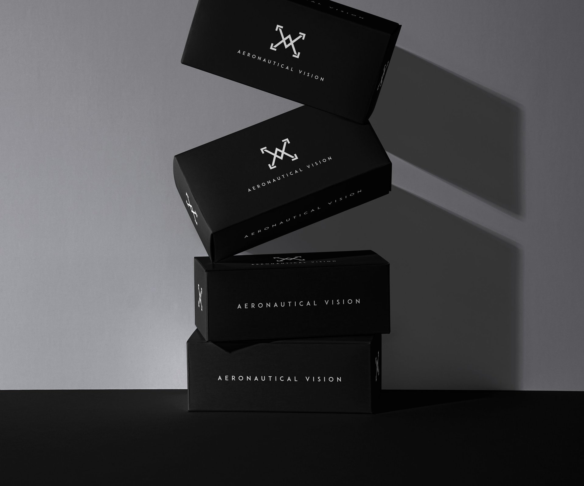
Aeronautical Vision
A Texan drone shop's logo design takes off!
Arvo
Revolutionising business with Augmented Reality and Virtual Reality
© 2025 Mark Hernandez
Like a wee chat?
Please, feel free to fire me an email or connect with me through social media. 👋